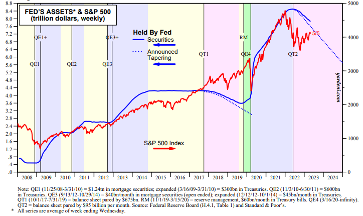
To support their pessimistic outlook, bearish prognosticators tend to focus on two charts. The first one shows the S&P 500 versus the securities held by the Fed, which account for most of the Fed’s balance sheet (chart). They contend that the bull market in stocks from 2009 through 2021 was driven by the Fed’s various quantitative easing programs. The S&P 500 peaked at a record high on January 3, 2022 as investors started to anticipate quantitative tightening (QT), which started during June of that year. The Fed remains on its QT course, which suggests to these bears that the rally since October 12, 2022 is a rally within a bear market.
We think that the stock market’s trend is driven mostly by the trend in earnings. We doubt that QT will cause either an economic or an earnings recession, let alone both. In our “rolling recession” scenario, earnings growth may be weak, but it should be positive.