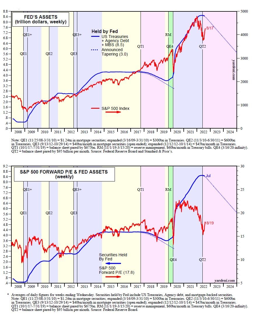
On our website, thousands of our charts are automatically updated as new data become available. The most bearish of the lot are shown below. The first one shows the Fed's holdings of securities versus the S&P 500. The second shows the former versus the forward P/E of the S&P 500.
We added a dotted line to track the Fed’s QT2, which ramps up in September and will reduce the Fed’s holdings by $95 billion per month, on average. It's an unsettling picture. The QE programs that expanded the Fed’s holdings of securities contributed to the bull market from 2009 through 2021. The fear is that QT2 will result in a long bear market for stocks.
However, the QE1-QE4 programs from 2009-2021 weren't the only drivers of the previous bull market. The S&P 500 always rises along with earnings during economic expansions, and the economy was mostly expanding over this period (except for a severe but short-lived recession in early 2020).
Furthermore, the federal deficit is shrinking. Over the past 12 months through July, the deficit is down to $1.0 trillion from $2.9 trillion a year ago on the same basis. In addition, over the past 12 months through June, foreign investors purchased $840.9 billion in the US bond market, including $618.8 billion in Treasury notes and bonds. We will soon see if the Fed's QE purchasing programs will be missed or not.